Histograms and Normal Distributions of Photocell Readings
Parts List
Laptop
CPX + USB Cable
Photocell
Resistor (10 kOhm)
Alligator Clips (x3)
Breadboard
This lab is going to be similar to the potentiometer lab. We are going to use a photocell though to vary the resistance. Photocells are cool because they change their resistance solely based on the light intensity hitting the sensor rather than twisting a knob.
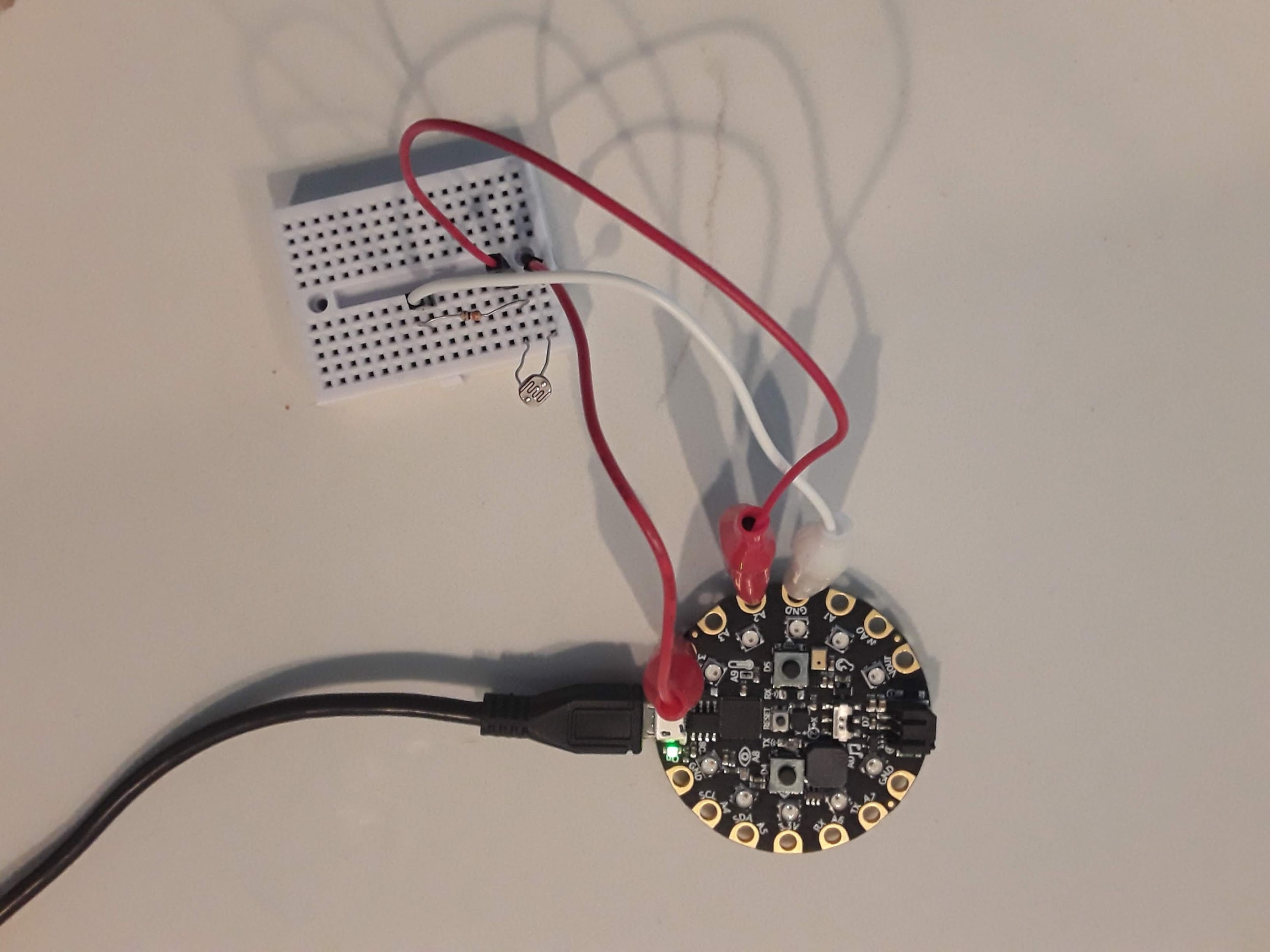
Wiring a photocell is similar to a potentiometer except that you need to add a resistor in series with the photocell. There is a relevant Adafruit Tutorial on Photocells and the code required to measure the voltage if you’d like to read more about it. The lab this week requires you to do the same as the potentiometer lab. I’d like you to wire up the circuit, take data at the low and high value of the photocell by covering the sensor with your finger and then shining a light on it and plotting the entire data set in Python on your desktop computer. The wiring diagram is shown below. Have an alligator clip connected to 3.3V on the CPX and have it connected to either end of the photocell. Then place a resistor in series with the photocell and route the free end of the resistor to GND.
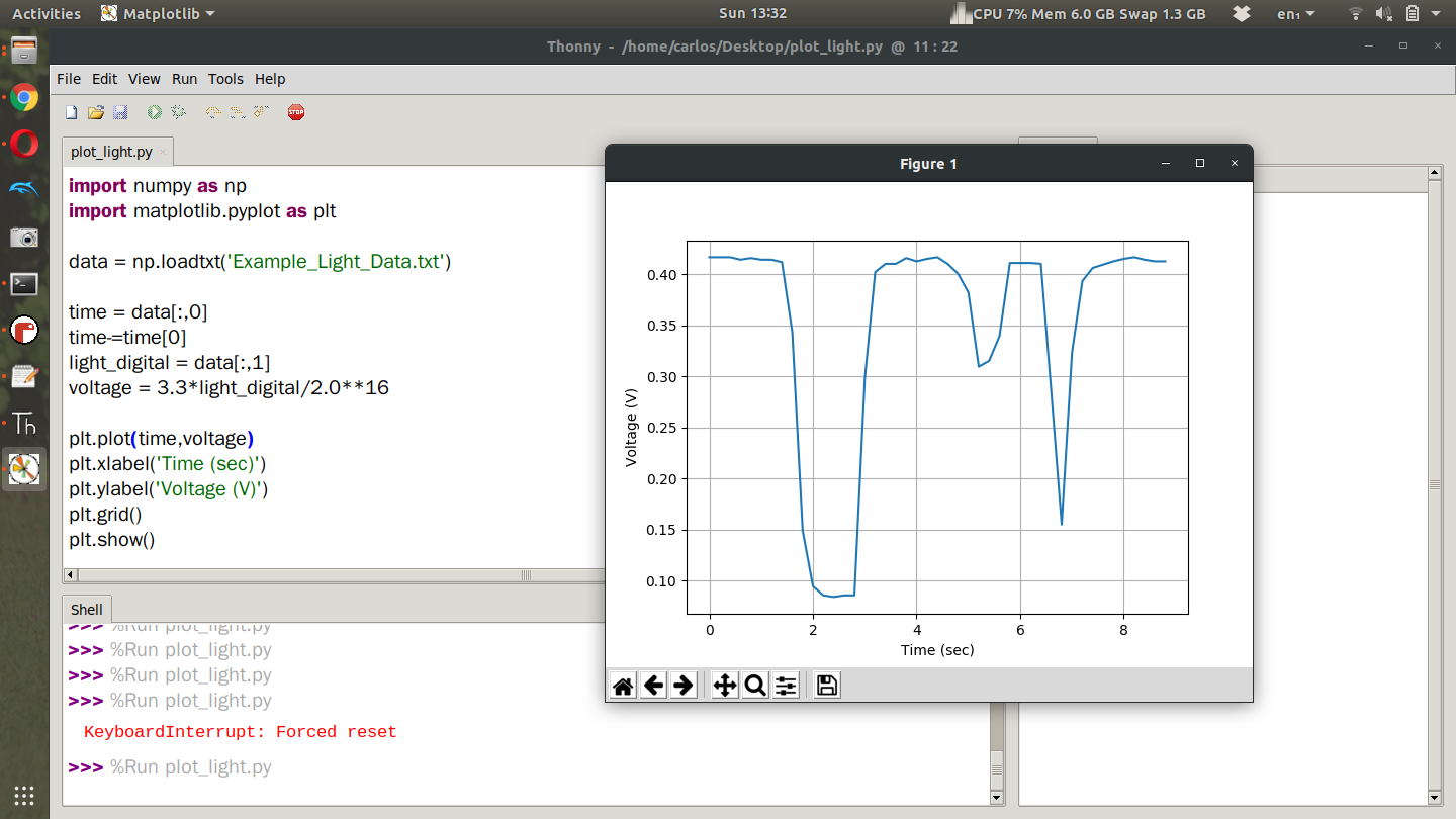
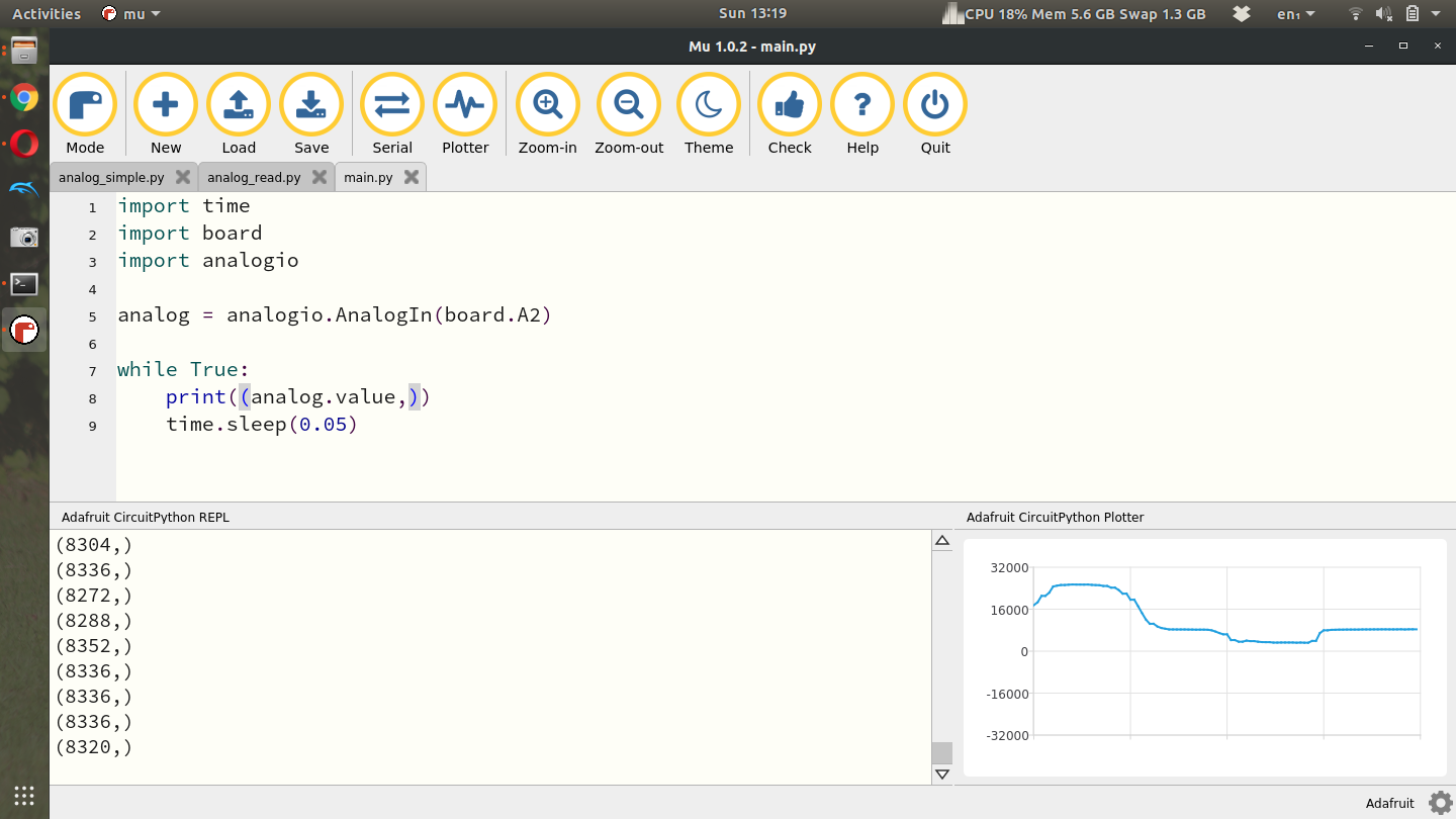
Then take another alligator clip from pin A2 and plug it into the same row on the breadboard as the resistor and photocell. Once you have the circuit wired properly you can use the same code as the potentiometer lab. The example screenshot below shows the analog signal below showing a high spike where I placed a flashlight over the photocell and then a low spot where I covered the photocell with my finger. Remember that you can use any Analog pin on the CPX provided you change line 5 to the same pin.
Once you’ve gotten some example data you can plot the result in Python as you did for the potentiometer lab. Here’s what your plot may look like.
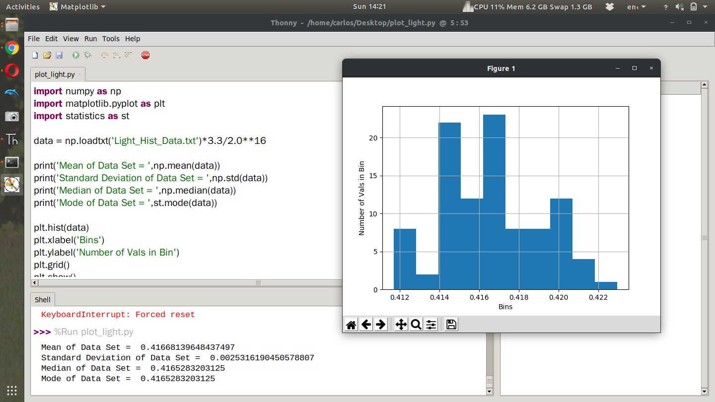
If you noticed the data you obtained even when the light source was constant was quite noisy. What I’d like you to do for part 2 of this lab is take 100 data points with the photocell with as constant of a light source as possible. Do this for three different light ranges. Low Light, ambient light and then a flashlight. With the three different data streams, create a histogram of the data with appropriate labels and compute the mean, median, and standard deviation of the data stream. Creating a histogram in Python is fairly simple and I have a Youtube Video to supplement this tutorial. I also have another video here where I get mean and median values for accelerometer data. Still, here is my example code showing code to get mean, median, and standard deviation as well as create the histogram. Notice in my code I imported the statistics module to compute the mode. Although it worked in my code, it’s not typical to compute the mode of a continuous variable because often times you will not ever get the same value twice. Still, feel free to compute the mode if you so desire.
Again make sure to convert to voltage before you plot that way you can see what the noise level is in volts. Notice that I import the data and convert to voltage all in one line. However, note that my text file only has 1 column of data. It’s possible your data has time in the first column and light value in the second column at which point you will need to extract the second column first and then convert to voltage. If you have two columns of data you’ll need to add a few things. First, don’t convert to voltage when you import the data.
data = np.loadtxt(‘Light_Hist_Data.txt’)
Then extract the second column (assuming your photocell readings are in that column)
second_column = data[:,1]
Finally convert to voltage
voltage = second_column*3.3/2.0**16
Then replace data in the rest of your code with voltage. Remember to remove st.mode since it does not work all ofthe time for continuous data sets.
Throwing out Outliers
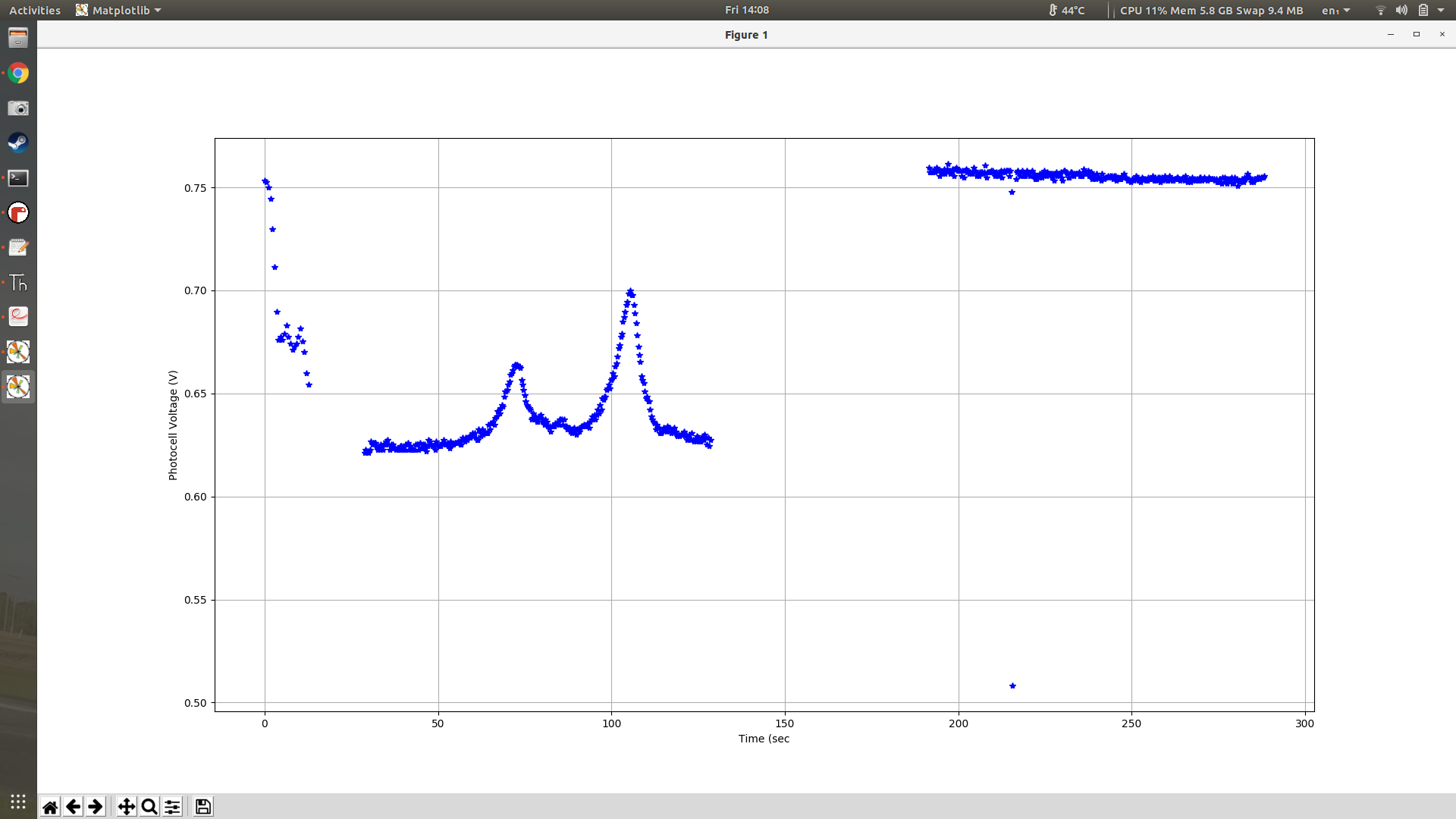
When I ran this experiment for a second time my CPX started and stopped 3 separate times. You'll see in the time series plot below that the voltage dipped in the first set and the second data set had some weird bumps probably from me changing tabs on my chrome tab. The photocell was close to my computer so that effected it. Thankfully the 3rd data set looked pretty good.
The only problem with the 3rd data set is that I put my hand over it for testing purposes. Because of that I had to remove those outliers. To do that I computed the current mean and standard deviation and then threw out all data points that were 3 standard deviations away from the mean. The code looks like this.
##COMPUTE CURRENT MEAN AND DEV
mean = np.mean(voltage)
dev = np.std(voltage)
print(mean,dev)
time = time[voltage > mean - 3*dev]
voltage = voltage[voltage > mean - 3*dev]
time = time[voltage < mean + 3*dev]
voltage = voltage[voltage < mean + 3*dev]
###COMPUTE NEW MEAN,STD
mean = np.mean(voltage)
dev = np.std(voltage) print(mean,dev)
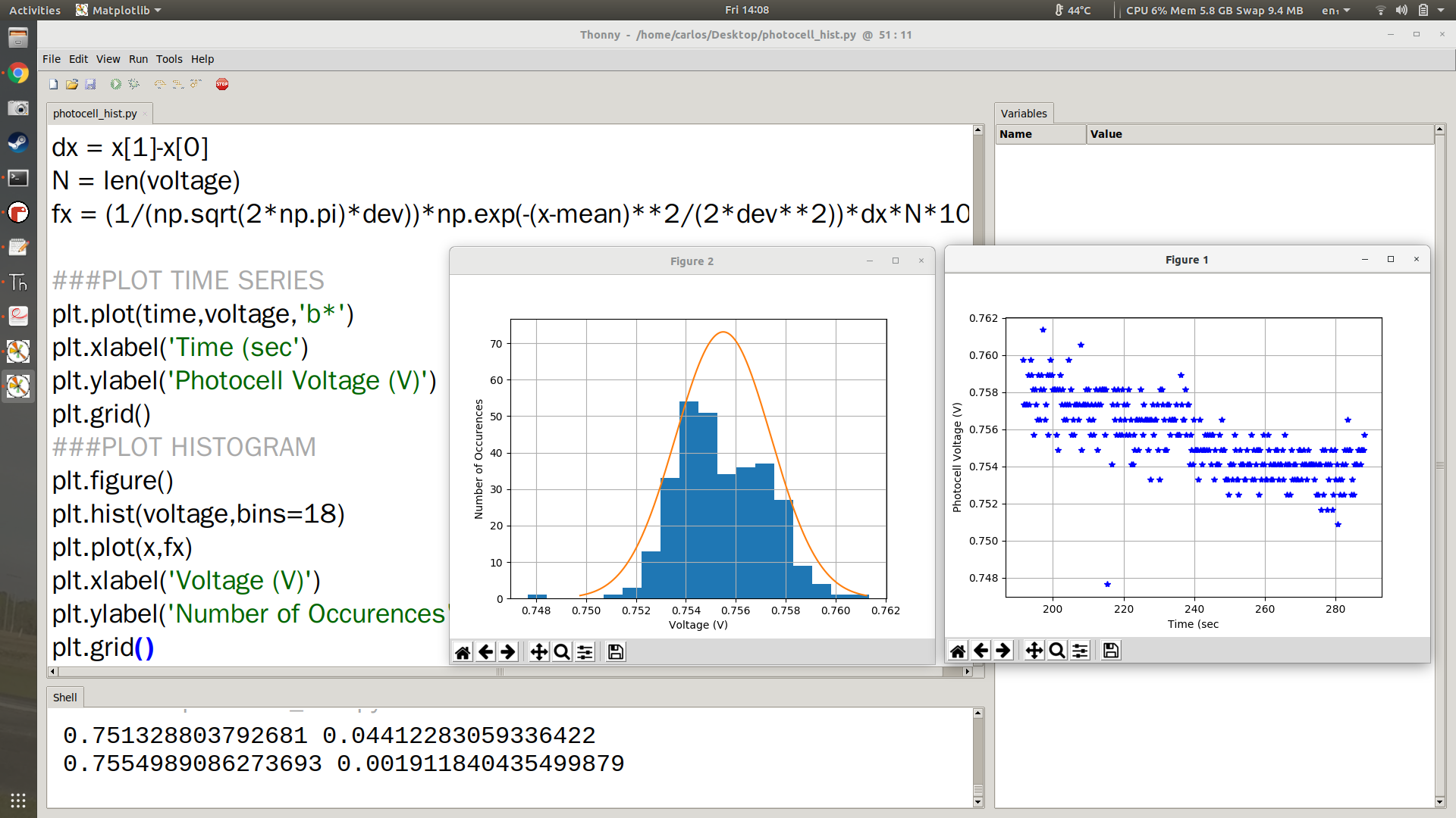
Once I did all that clean up I was able to get a nice time series plot of my data.
I also was able to plot the Normal Gaussian Distribution on top of the histogram. You can see that in the left plot in orange. The code to do that is shown below where the 72 in the plot is the "height" of the histogram. Note that your histogram will have a different height and you will need to get that specifically from your plot.
###COMPUTE THE NORMAL DISTRIBUTION
x = np.linspace(-3*s+mu,3*s+mu,100)
pdf = 1.0/(s*np.sqrt(2*np.pi))*np.exp((-(x-mu)**2)/(2.0*s**2)) * (s*np.sqrt(2*np.pi)) * 72
The equations above make a time series from +-3 standard deviations from the mean and then plot the PDF of a normal Gaussian distribution. The only extra thing you have to do is multiply by (s*np.sqrt(2*np.pi)) * 72 which first causes the height of the PDF to be 1 and then multiply by 72 which again is the height of the histogram which will be different for your system.
Turning in this assignment
Once you've done that upload a PDF with all of the photos and text below included. My recommendation is for you to create a Word document and insert all the photos and text into the document. Then export the Word document to a PDF. For videos I suggest uploading the videos to Google Drive, turn on link sharing and include a link in your PDF.
Part 1
Include a video of you varying light conditions and watching the digital signal in the Plotter in Mu go up and down (make sure your face is in the video at some point and you state your name) - 50%
Include your Python code in the appendix along with your data plotted in a Figure. Make sure to plot the voltage and not the digital output - 50%
Part 2
Include a video of your circuit and explain how you captured the data to store on your computer (make sure your face is in the video at some point and you state your name) - 25%
Include the mean, median, and standard deviation of all light levels in volts - 25%
Include 3 histogram plots of low light, ambient light and high light levels. On top of the histogram I want you to plot the normal Gaussian distribution to see how close your histogram is to a Gaussian distribution - 50%
Last updated